«Mouseflow Web Funnel Teardown
This teardown is part of a weekly series where I examine a prominent company’s web funnel and give my thoughts on how well they’re guiding new users through the purchase process. If you’d like to get these teardowns free in your inbox: signup here.
Mouseflow Overview
Welcome to the first edition of Web Funnel Teardowns.
To kickoff this series, I chose a web analytics company that I’ve personally used on a number of projects.
Mouseflow takes video of visitors as they move through a website. Although it might feel a bit strange seeing your visitors’ exact movements, Mouseflow lets you watch second by second replays of how each person moved their mouse, how far they scrolled, and precisely where they clicked. This gives great insight into where visitors are struggling and what content they’re skipping.
It’s essentially cheaper and easier user testing.
To this day I’m an active subscriber and I’ve learned a tremendous amount about user behavior from watching Mouseflow videos.
On to the Teardown!
I’m prefacing all my teardowns with the disclaimer that you should almost always test improvements to your website instead of implementing them blind. What may seem obviously better or a “best practice” doesn’t always convert well.
“Test improvements” means doing A/B testing or multivariate testing in order to find out if the new version you’ve come up with is actually better than the old one.
To find out more about A/B testing, check out Chapter 7 of my free e-book, Seven Steps to More Paid Signups.
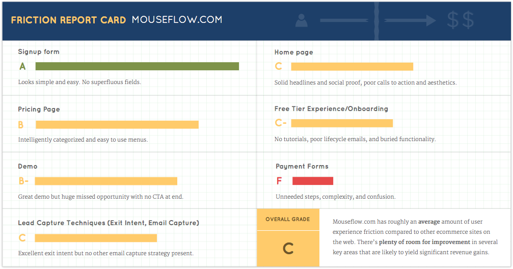
Friction Report Card
Take a look at Mouseflow’s Friction Report Card. I looked through their site, identified key points in their funnel, and gave them a grade on how much friction is present, or in other words, how difficult or straightforward it is for a user to accomplish the goal.”
 If you'd like to get your website's User Experience Report Card, go here for more info.
Down below I'll go into greater detail on why I gave the grades that I did.
Pay special attention to the payment forms breakdown. I saw quite a few exciting opportunities in that step and dropoffs at the end of the funnel are particularly painful. You get a visitor so close to converting only to lose them at the finish line.
Home Page
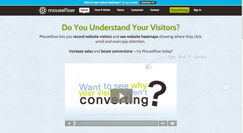 The first item that stands out to me is the “Try Mouseflow today!” call to action. Having a “try it out” button or link placed right after your main headline is a solid strategy but I see a few ways Mouseflow’s could be improved.
First, the current text is not clickable. This might be a missed opportunity to move visitors a step farther down your sign up process.
Second, the style and placement of the text doesn’t stand out from the other content. I would make this call to action more prominent.
Last, Mouseflow has a free tier so I would consider testing “try Mouseflow free today!”
Below the headline I see they’ve employed a “how it works” promo video.
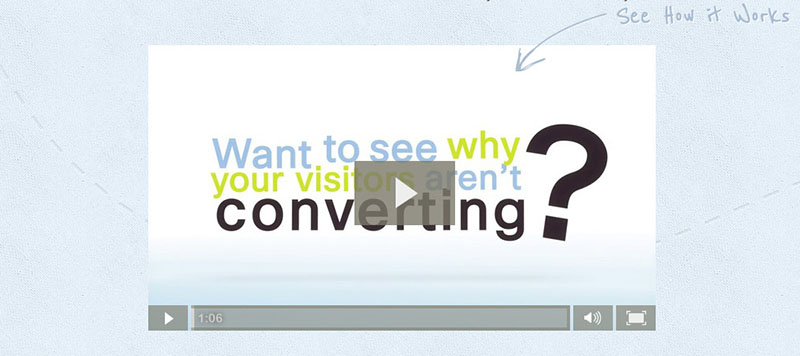 Videos can be an excellent way to impress new visitors but they can’t be relied upon. According to Invodo, only 12% of e-commerce visitors view a video when one is availible.
Mouseflow is giving a lot of prime real estate to a piece of content the majority of their visitors are unlikely to utilize. I might try different versions of this landing page with the video further down the page.
That being said, the content of their video is excellent. It’s short (68 seconds), snappy, professional, and benefits focused. It also ends with a strong call to action.
To get more people to watch the video they could make it clearer that it will only take a minute to watch or try a more engaging video preview image.
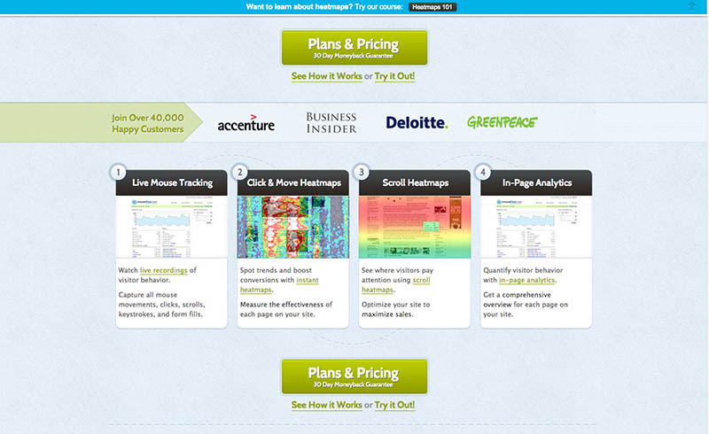
As I scroll down the page I’m greeted with a few calls to action, some logos of current customers, and a more detailed look at the features. Overall this section feels aesthetically outdated which has the effect of lowering my confidence in the product.
 If it’s been years since they’ve taken the time to refresh the look and feel of the website, is this even an active company? Are they adding the newest features and fixing bugs? Will they respond to my support requests? Will I feel proud to recommend this to my clients and friends?
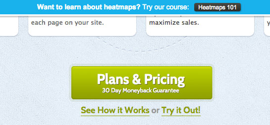
I also think the text on the green calls to action could be much better.
“Plans and Pricing” is not very exciting. It reminds me that I’ve got to buy something and wade through plan details. Something benefits focused like “Start Getting More Conversions” is much more enticing. I do like the money back guarantee however.
Another issue is having three competing links to click (“Plans & Pricing, “See How It Works”, “Try It Out”) in close proximity of each other. They’re subtly different calls to action and if I’m unsure which one applies to me, I’m liable not to click any of them. People like easy decisions.
Farther down, the second call to action on the page is a carbon copy of the first. To me this is a big missed opportunity. It’s difficult to know what will excite a visitor to take the next step and trying different calls to action is a way to try messaging variations to see what works.
 Moving on, the social proof section is very well done. A rotating list of impressive, big name customers is powerful and the 40,000 strong user count makes me feel confident that many of my peers trust this product.
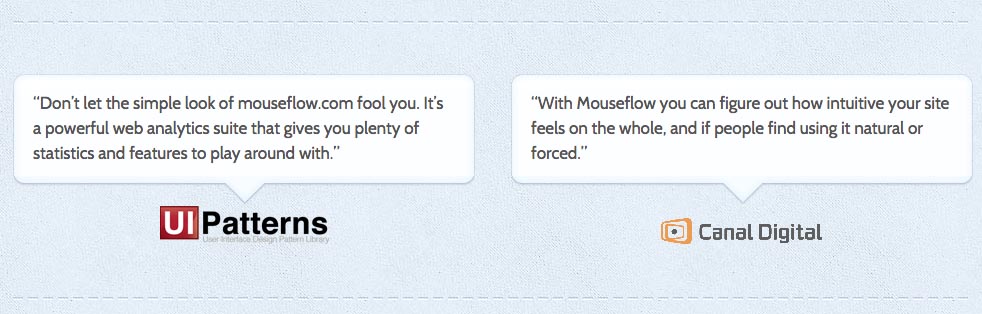 The dual testimonials at the bottom reinforce the social proof. To improve these testimonials I would try adding the names and faces of the people who wrote them. More and more visitors trust individuals over companies.
On that note, it’s interesting that on a website focused on user behavior there isn’t a single picture of a person. That may be something to try adding. 37signals got a 102% conversion lift by adding a large picture of a person on Highrise’s landing page.
Next up we’ve got one of my favorite parts of a landing page: the benefits section.
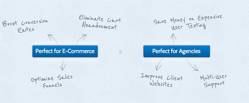 Most of these benefits are pretty solid and they speak directly to what Mouseflow’s target market cares about, mainly more conversions.
The benefit I don’t like is: “Eliminate cart abandonment.” Completely stopping cart abandonment is actually impossible. So you’re promising something you can’t deliver and that immediately lowers my trust in your other claimed benefits.
Overall, the main issue with the benefits list is that they’re difficult to read. With the way it’s laid out, your eye has to do a lot of bouncing around in order to read them all. The pale blue font on paler blue background isn’t the easiest to parse either.
Besides the areas for improvement I’ve already mentioned, there are three additional elements that I would test on this landing page to boost conversions:
-
Points of differentiation. There are hundreds of analytics tools out there, some with similar functionality. Why should I choose Mouseflow over other services like it? Why is it unique and different?
-
Make demo more prominent. Mouseflow actually has an awesome interactive demo but the only links to it are in the nav menu and in easily missable links below and to the right of the main CTAs. Getting users into the app quickly is is a fantastic way to increase conversions. I think this is a missed opportunity.
They could also consider showing some auto looping demo videos as a way to cut right to one of the best selling points. Showing is often worth far more than telling. -
Data security. Mouseflow takes video of my users interacting with my website. If I care about my customers, I’m going to want to know that my data is safe and secure. Also, what happens to video taken of sensitive info like credit card numbers?
Free Lead Capture Resources
Two of my favorite strategies for increasing conversions are capturing an email address through the use of a free carrot and getting a user into a free trial/plan.
Visitors aren’t always in a position to buy now, but if you can get them on your mailing list and continue to deliver value to them, you'll stay top of mind for when they’re ready.
At first it appears that Mouseflow does have an email capture strategy. On every page of their sales funnel there is a fixed blue bar at the top that follows you as you scroll down the page. It’s advertising a free heatmap course.
 As for the copy, I doubt most people will want to learn about heatmaps. What they will want to know is how heatmaps can get them more conversions. Also, when I click on the button I’m not taken to a lead capture form.
Instead I’m taken to a pretty short and salesy blog post about Mouseflow. I’m required to click one of the links at the bottom of that to get to any of the actual info and those only take me to another short blog post. Nowhere am I asked to enter my email address which feels like a missed opportunity.
Mouseflow does utilize a technique that I’m quite fond of: the exit intent popup. Move your mouse back up to the browser bar as if you’re leaving the page and you’ll be greeted by this popup:
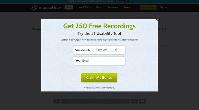 I love exit intents because they leverage the conversion power of a popup without interfering with visitors’ first impression of your website.
Mouseflow is doing all kinds of a great things with their exit intent.
First, they’re offering free value to the user above and beyond what they’d normally get in the free trial (in the form of extra free recordings).
Second, they’re claiming to be the #1 usability tool which helps differentiate themselves from competitors.
Next, this is essentially a lead capture form. Even if a user doesn’t follow through with making an account from the link emailed to them, Mouseflow still has their email address so they can follow up and continue to build a relationship by offering additional free value in the form of blog posts and more freebies.
“Claim my bonus” is a strong CTA and Mouseflow is utilizing a negative opt out (“I don’t like free credits”) to underline the consequences of not accepting the bonus. This can be a dangerous technique so use it with caution but it can be effective.
One possible improvement is removing the visits/month field. If I have to stop and think or possibly check my analytics, it kills the quick impulse signup. If you really need this info you can get it from them later after the user has signed up.
Pricing Page
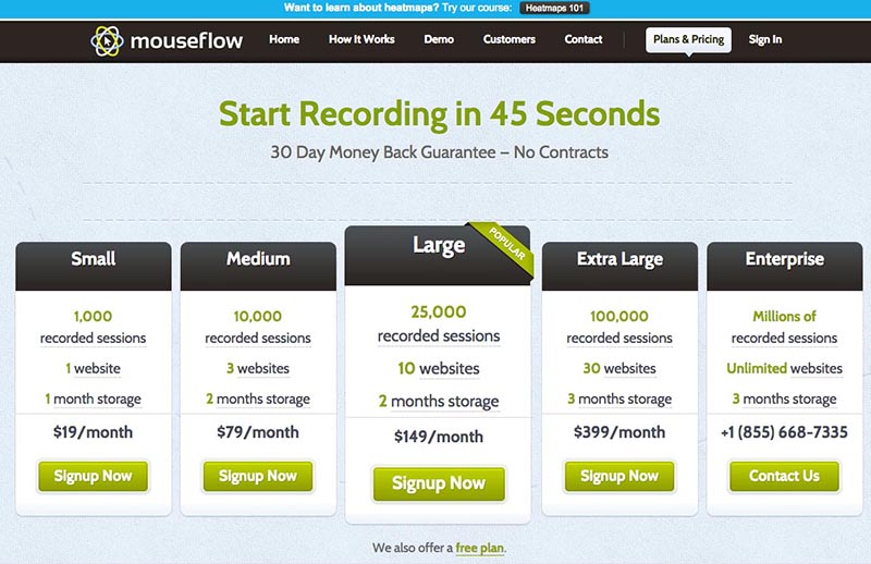 The headline is an excellent example of encouraging users with how easy your signup process flow is. I can start using this in 45 seconds? Not bad.
I also love the money back guarantee and no contracts copy.
As for the actual packages, Mouseflow has done a great job of simplifying the offerings at the top to just the 4 most important aspects of their packages (price, number of sessions, number of domains, months of storage).
What I would recommend is naming their packages something better than small/medium/large in order to help potential customers choose the package that is right for them. The founder of Bidsketch has a solid guide on SaaS package naming.
I like the credit card logos and a huge plus for having a Paypal option. It’s almost always a conversion booster.
Displaying the client list again on the pricing page is another shrewd move to help ground the prices in legitimacy.
You might notice that the free plan has been given a pretty small place below the top pricing plans. It’s just a small link.
 This is a popular technique that’s been going around recently in the SaaS community. The idea is that a lot of people might just buy a package if they don’t realize there is a free tier.
Before advising someone to utilize this tactic, I would look at the numbers around how well this pricing page is converting as well as the free tier to paid conversion rate.
If the pricing page is doing a terrible job converting but the free tier upgrade percentage is solid, it probably makes sense to just be patient and get new users into the free tier.
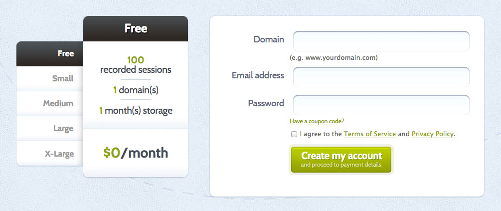
Signup Form
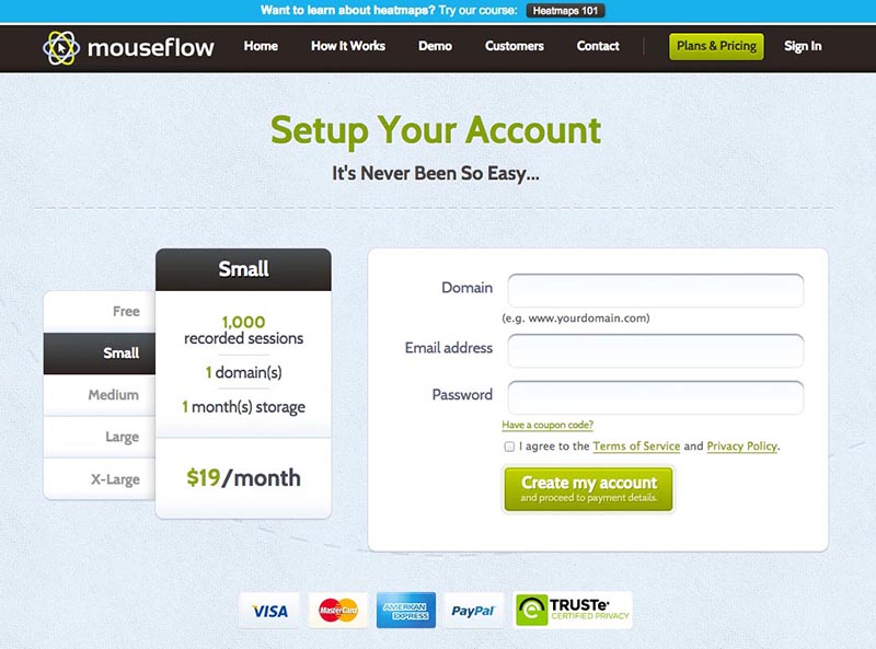 Overall this is a pretty nice signup form. Most importantly, it looks pretty easy to accomplish. There are no superfluous fields like company, phone number, or name.
I also like breaking up the credit card details form into a later step. That way you can followup with the users who fill in their email address but don’t complete the credit card stage for whatever reason.
My main improvement recommendation would be to remove the blue heatmaps bar and the top black navigation. You’ve got the user exactly where you want them, ready to whip out their credit card. Don’t distract them from the number one action you want them to take.
Payment Forms
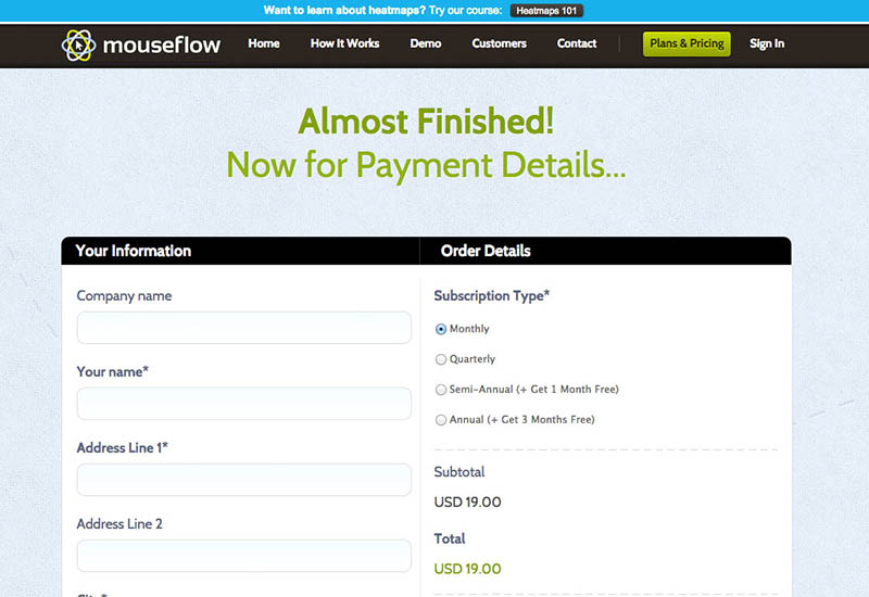 This is where things start to fall off the rails a little bit.
Remember how easy the previous form looked? This form looks the opposite. I have to scroll quite a bit just to see all the fields. There are also a number of optional (company name/phone/state) fields that are just making this form look scarier. Removing them should increase conversions.
Stripe could also be considered as a payment processor that doesn’t require address info which would further reduce form fields.
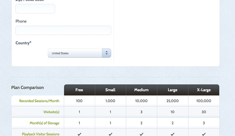
Also, why is the plan comparison on this page again? I’ve already had two chances to select my package. This chart only feels confusing and distracting to me at this stage. Do I have to choose my plan again?
 At the “end” of the form there is “Pay by Card” and “Pay by PayPal”. If I choose to pay by Paypal, why do I have to enter all of my payment details? Paypal takes care of all of that so it’s hurting conversion rate to make Paypal users enter all of that again.
One concept I do like on this page is that they offer discounts for paying annually and semi-annually. Getting longer term commitments is great for your cashflow and is worth giving a discount to encourage.
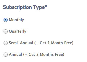 The drawback is making your customers think too much and offering too many options in an already long form. As an alternative, start simple with just monthly billing and then send a follow up email once they’ve converted which offers a discount for paying for more up front.
Overall, with some creativity this entire second form seems like it could be removed. No matter how well done, you’ll almost always lose some additional conversions when there is an added step.
After I click pay with credit card, first there is a only tiny loading spinner so I’m not really sure if anything happened. It took a few seconds before a new page loaded.
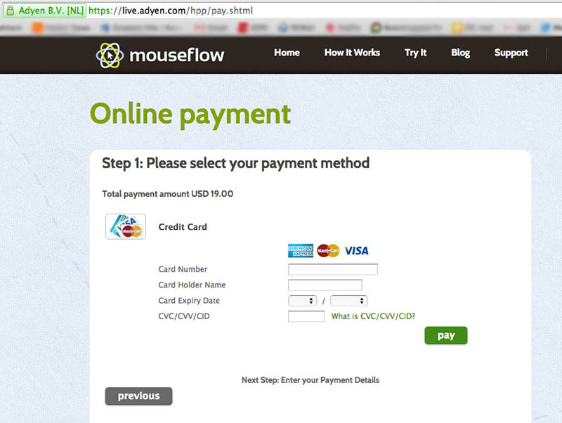 And that new page turns out to be on a different URL (live.adyen.com/hpp/pay.shtml) with a copyright at the bottom of 2013. Also, the new CC details form has a different look and feel.
Savvy internet users might think this looks like a phishing scam and just drop off right here. Even users who might not know about phishing scams might be confused and feel that “something is off” by the change in URL and look of the form.
I know Mouseflow is legit and I’ve encountered this before so I know exactly what’s going on. Mouseflow is using a third party payment processing solution to handle their credit card payments. That's fine but I’d highly recommend they mask the URL to keep the user at least on a subdomain of mouseflow.com and to unify the look and feel of the form with the rest of their website.
Demo
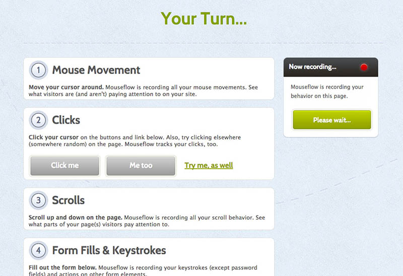 One of my favorite parts about Mouseflow’s marketing is their demo. It’s a really great low friction way to see the product in action and to give a visitor an “a ha” moment about why this is something they’ll want to use.
Unfortunately, at the end of the demo, things take a bad turn.
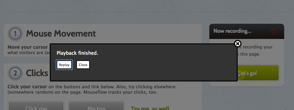 I’ve just watched magic in action, I’m as stoked as I’ve ever been about Mouseflow, and my only two options are “replay” and “close” which actually closes or freezes the window I’m in. Huge missed opportunity.
I’d test a big ol’ “Start Recording On Your Website Now” button right here.
Free Tier Experience/Onboarding
When you choose to sign up for the free tier, you’re taken to the signup form we’ve looked at previously.
 One problem I see here is that it says “proceed to payment details” on the green submit button. This is misleading because free users are never actually asked for credit card info with the free tier. If you’re not going to require them, don’t make users think it’s going to be the kind of free tier that they’ll have to enter their credit card details for. Many will drop off if they think they’ll have to pull out their wallet.
In fact, I would be hitting free tier users over the head with “No credit card required!”
Next up you’re asked to install the tracking script.
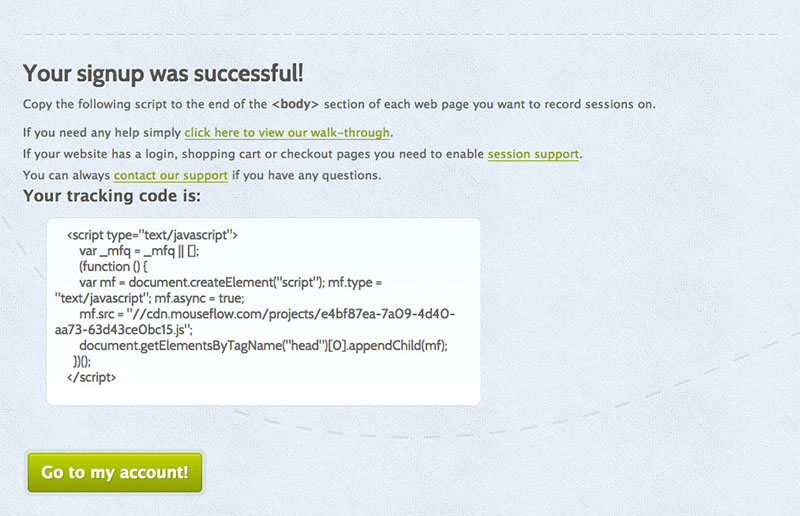 This is reasonably well done, although making people go to a third party website to view the more in depth installation instructions seems unnecessary. I’d just put them further down the page.
Next I click the big “Go To Account Button” and I’m taken to…
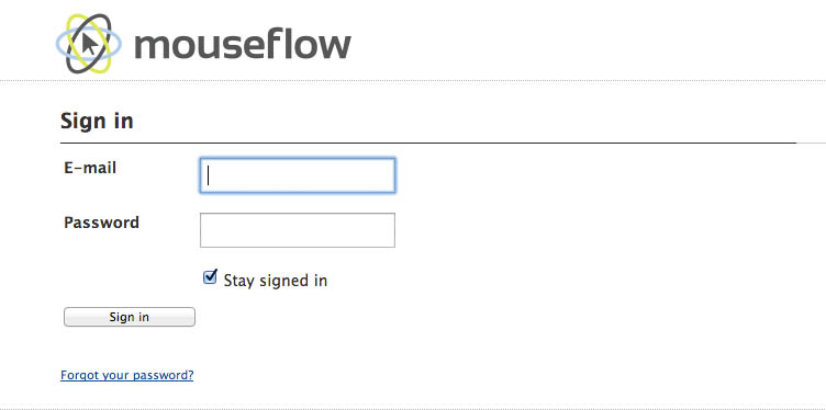 The login page? I just entered my username and password at registration. Why am I forced to enter them again? It’s important to make it as easy as possible to get new users to get value from your app. Every roadblock you put in their way lowers conversions.
Let’s say this “little annoyance” knocked off 10% of people from the process and normally 25% of free tier visitors convert to paid. That means you can get 2.5% more paid signups just by fixing this little problem. Not bad for a quick fix.
For the sake of argument, if Mouseflow’s lifetime customer value is $200 and they average 2000 free trial signups per month, fixing the login bug would be worth $120,000 per year. You can see how all these “little” issues really start to add up.
Anyway, I login and I’m dropped into the app.
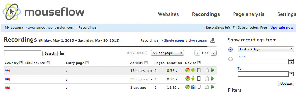 My first impression is that most of the content here is small and hard to read. There is a lot on the page and it’s not obvious what most of it does. It doesn’t inspire a lot of confidence that “this is going to be easy to use” which is enough to lose some users.
There is also no tutorial or walkthrough telling me what to do next. Once the script is installed, I need to know to go visit my site or wait for traffic in order to take her for a spin. And once I do, there is no indication that new recordings are ready for view. I’ll have to manually refresh the page. I might try something like Twitter that lets you know there are new tweets to view when fresh data comes in.
This first moment is crucial to getting people to the “a ha” moment and you want to make it as easy as possible for them to get going using your software.
Once I do get some recordings rolling, I’m going to need to find this tiny green button at the far end of my entries in order to start playback.
Given that playback is the main feature of mouseflow, I’d recommend testing having the entire row by clickable to start playback. Or having a tutorial overlay explain about the green play buttons would be helpful. Or making those buttons much bigger and obvious. Relying on your users to figure this out isn’t a great gamble.
Next up, I was promised heatmaps. Where are my heatmaps??? Good question.
I don’t see anything about heatmaps anywhere on this page despite the fact that heatmaps were a big selling point in the marketing copy. Perhaps they’re not included in the free tier? Well let’s explore a bit and try the vaguely named “page analysis.” Technically everything Mouseflow does is “page analysis” but let’s try it anyway.
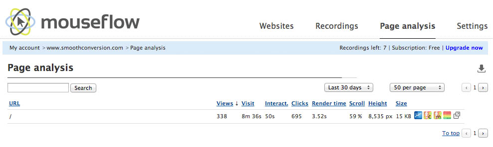 Hmmm, OK. There’s the url of my homepage. We’ve got some numbers that don’t mean a whole lot to me at the moment. “Visit.” “Interact.” “Scroll.”, “Height.” I’m not sure what those mean and hovering doesn’t give us any more info. Hmmmm, no heatmaps.
Maybe if I click on the row I’ll get something. Nope, nothing. Maybe those tiny little colorful icons do something?
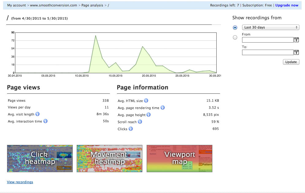 Here we go, there are my heatmaps. I’ve got to think many free trial users never find these. Which is too bad because they’re actually pretty awesome once you get there and open them up.
Besides a tutorial, another way Mouseflow could help new users get the most out of their product is by a series of lifecycle emails. They do send one lifecycle email although the copy and style leaves a lot to be desired.
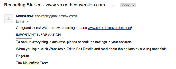 Once the first recording has occurred, they email you to let you know you can watch a video. This is smart. They’ve anticipated that some new users will install the script and then leave or get distracted before anybody has visited their website (or they forgot to refresh the page).
They should have a link to your account page though somewhere in this email.
I’d recommend testing a few other lifecycle emails that instruct a user on how to operate the various functionality in Mouseflow. For example, once you’ve got 25 or so recordings, the heatmaps start to get interesting. So after a user reaches that plateau, sending an email showing how to access and get the most out of the heatmap section could be quite effective.
With free trials and free tiers, it’s all about making sure your users are getting the most out of your app so they stick with it and upgrade.
Conclusion
Despite already running a successful and widely known analytics company, Mouseflow has lots of great possibilities for getting a better conversion rate. But most companies have limited time, money, and traffic to implement and test improvements with.
So how do you decide which of your test ideas to try first?
If I was working with Mouseflow, the next step I’d take would be to examine their analytics numbers and see how many users were dropping off at each stage. I’d also look at how other analytics companies are doing at crucial steps in the funnel to see how Mouseflow was doing compared with industry averages.
The numbers I’d be especially curious about are the payment page abandonment rates and the free trial to paid conversion percentage. From a user experience perspective, those seemed like the lowest hanging fruit.
Next, I’d apply Mouseflow’s financial numbers such as client lifetime value to the analysis. That will help me see how much achievable improvements to each step of the funnel will be worth to the overall bottom line.
Based on that criteria (user experience, financial analysis, analytics, and industry benchmarks), the testing priorities should reveal themselves.
That’s it for Web Funnel Teardown number one. I hope you enjoyed it. If you’d like to get next week’s free in your inbox, signup here.
Want to know how well your web funnel is doing?
Enter your email address and website url and I’ll send you a free user friction report card that grades each step in your signup flow.