«Everyday Health Web Funnel Teardown
This teardown is part of a weekly series where I examine a prominent company’s web funnel and give my thoughts on how well they’re guiding new users through the purchase process. If you’d like to get these teardowns free in your inbox: signup here.
Everyday Health Overview
Welcome again to another edition of Web Funnel Teardowns. This week’s edition: Everydayhealth.com. Everyday Health is a media website that offers advice about, you guessed it, healthy living.
They don’t explicitly sell any products or services on their website. Instead, their main revenue appears to be the advertisements that are placed around the website.
Now you may be wondering, Lennon, if they don’t sell anything, what’s their funnel?
Good question. In order to answer that, we first have to figure out what a “conversion” would mean for Everyday Health. Here are the two I’m going to focus on today:
-
Get a visitor to view multiple pages instead of bouncing. The more pages a visitor views, the more ads they see. The more ads they see, the more likely it is that one of them catches their eye and they click.
-
Signing up for the mailing list or following on social media. When a visitors takes one of those two actions, their likelihood of becoming a repeat visitor skyrockets.
As for how those goals translate to a funnel, every step needed to get a user to sign up for the mailing list makes up the email capture funnel. This is no different from getting a user to sign up for a paid service.
For pages/visit, it’s a bit tricker but if you consider every additional pageview a conversion, then with a little imagination you can see a funnel that looks like this:
- Page 1: 100%
- Page 2: 30%
- Page 3: 20%
- Page 4: 10%
- Page 5: 4%
- Page 6: 2%
- Page 7: 1%
The main difference is that instead of getting rewarded in revenue for getting a visitor to the final step, you get rewarded for every additional step completed.
In this example breakdown, the biggest dropoff is getting people on to that second page which might indicate it’s a lucrative spot in the funnel to examine and optimize.
On To The Teardown!
As usual, I’m prefacing all my teardowns with the disclaimer that you should almost always test improvements to your website instead of implementing them blind. What may seem obviously better or a “best practice” doesn’t always convert well.
“Test improvements” means doing A/B testing or multivariate testing in order to find out if the new version you’ve come up with is actually better than the old one.
To find out more about A/B testing, check out Chapter 7 of my free e-book, Seven Steps to More Paid Signups.
Friction Report Card
Take a look at Everyday Health’s Friction Report Card. I looked through their site, identified key points in their “funnel,” and gave them a grade on how much friction is present, or in other words, how difficult or straightforward it is for a user to view more content, engage on social media, or sign up for the email list.
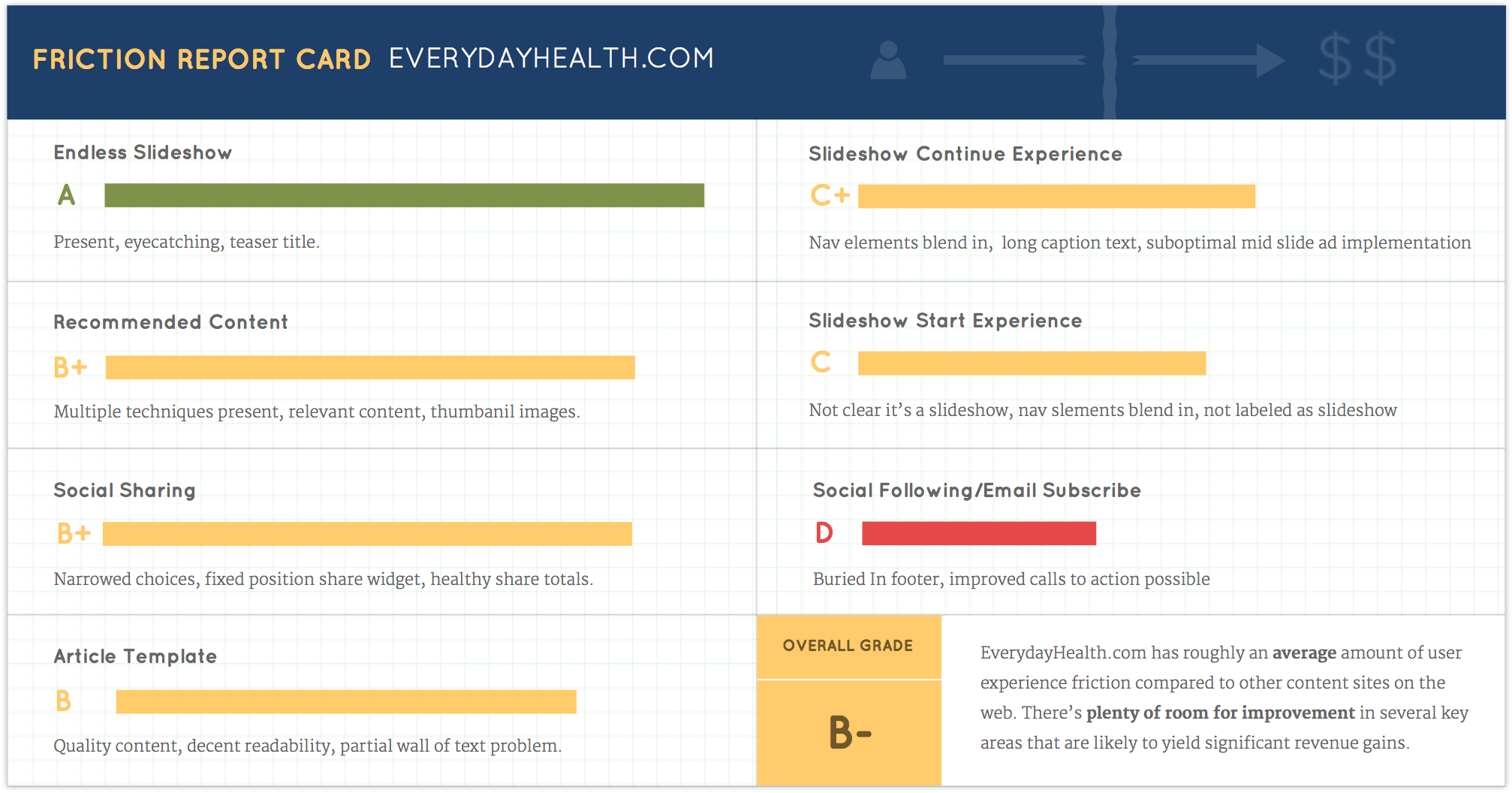 If you'd like to get your website's User Experience Report Card, go here for more info.
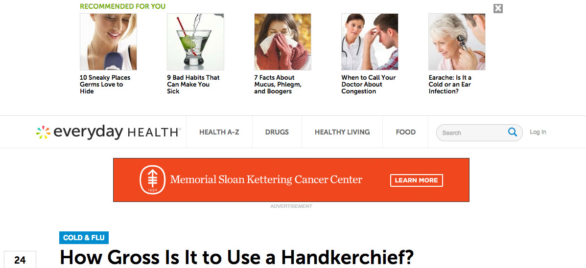
Slideshows
 Slideshows are becoming an increasingly popular element because of their ability to immensely improve pages/visit. Everyday Health’s slideshow template is solid but I see a number of areas for improvement.
To aid us in zeroing in on what part of the slideshow template we should focus on, I’m a big proponent of figuring out what your key performance metrics (KPIs) are or in other words, the most important numbers that speak to the health of your business.
For slideshows, one of these KPIs is slideshow start percentage, or the number of visitors who proceed from the first slide to the second slide. Slideshow visitors tend to fall into one of two categories:
- Those who visit the first slide and bounce.
- Those who view lots of slides.
Very few people view only two or three slides. If you can get people to continue past the first slide, most are usually in it for the long haul.
Therein lies the value of the “slideshow start percentage” metric. A small improvement in this percentage can be worth huge amounts of additional pageviews.
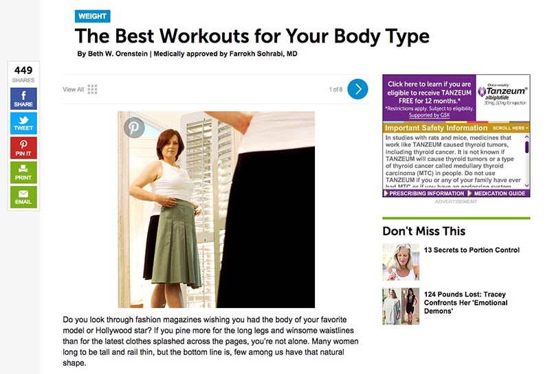
So how well is Everyday Health encouraging slideshow visitors to begin the slideshow?
The main opportunity I see in their slideshow template is improving how obvious it is a visitor has landed on a slideshow and not some other type of content.
The only real indicator is the two small blue arrows, the faint “view all” icon, and the small “1 of X” pagination counter. The arrows themselves are pretty small and buried on the right side of the content.
Also, the top blue arrow is close to an ad and similar enough to the Google Adsense arrow that it’s easy to think of it as part of the ad and not a call to action to continue the slideshow.
The bottom arrow is floating off all by itself looking unrelated.
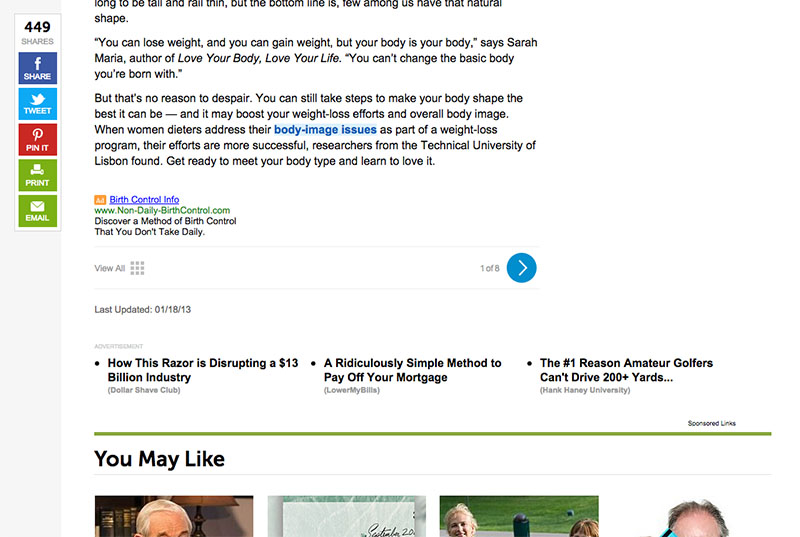 You want to make sure it is as clear as possible that this is a slideshow. People know what slideshows are and once they recognize that they’ve landed on one, they tend to engage at a high rate if they’re interested in the content.
Have your arrows cry out to be clicked through their big and bold design. Consider calls to action language such as “continue slideshow” and utilize next slide previews to encourage engagement. You can even put the label “slideshow” with an icon somewhere near the title in order to tip users off to look for the controls.
Something else I noticed is that, contrary to most slideshows on the web, Everyday Health’s often have long text captions that continue below the fold.
Besides getting people out of the rhythm of advancing through the slideshow, long captions might confuse visitors into thinking they’re on an article and not look to advance to the next slide.
When you tweak the usability mold of a common internet content type, there can be consequences. Do it cautiously and test it against a more expected variation when you can, in this case shorter captions.
I’d be willing to bet that Everyday Health could get some lucrative pageview improvements by doing some testing on this template.
The next important metric is the number of slides viewed per slideshow including follow up slideshows you get visitors to continue on to.
All of the improvements mentioned for improving slideshow start percentage should also help increase this slides viewed metric so you get a nice two for one bonus when you find something that works.
In addition, I noticed that most Everyday Health slideshows are fairly short, either 6 or 8 slides long. I would test longer slideshows as visitors who proceed past the first slide tend to be willing to continue for many more on that topic. There is usually a pretty steep dropoff at the end of a slideshow so longer slideshows can produce nice wins.
On the topic of “end of slideshow dropoff,” Everyday Health utilizes a technique that I love: the endless slideshow.
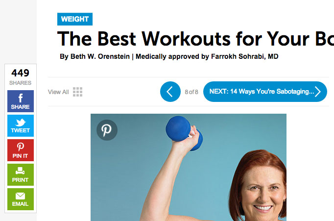 When you reach the last slide, a nice animation expands the “next” arrow and gives a nice title teaser to encourage you to continue on to the next one.
Most of the endless slideshow pairings appeared to be on a similar topic which is an excellent idea. Well done all around.
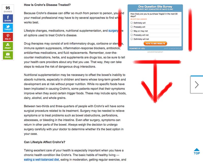
Another item that caught my eye is that in the middle of each slideshow an ad appears.
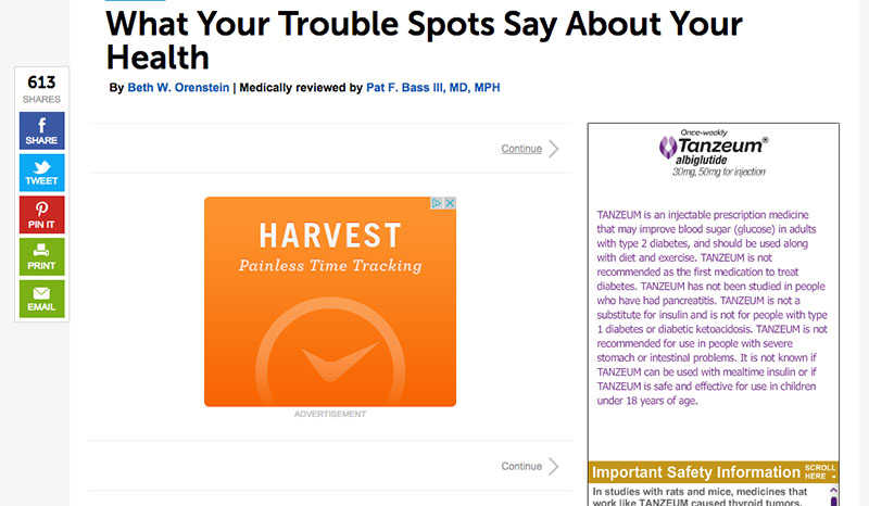 This technique tends to yield a very high performing CPM because of its “in rhythm” placement where a slide normally is. The only problem is that you tend to have a big dropoff at this slide so you have to balance the additional ad revenue of this unit with the increased visitor dropoff.
That being said, there are ways to implement the mid-slideshow ad and minimize the amount of dropoff you experience. I see some opportunities for Everyday Health to get more visitors both clicking this ad and viewing more slides
First, the blue forward arrows are now gone and have been replaced by almost invisible white continue arrows. It looks to me like the slideshow has ended which could prompt visitors to exit.
Everyday Health may have done this on purpose to bring added visibility to the ad, but if they haven’t already, I would recommend they weigh the visitor dropoff this technique incurs against the ad unit’s revenue.
Another reason people drop out is that ads sometimes load slowly and a visitors sees this:
![]() There isn’t much you can do about the load time because ads are loaded from a third party. But what you can do is show a loading spinner until the ad appears so that people know something is happening. This should buy you a few more crucial seconds.
There isn’t much you can do about the load time because ads are loaded from a third party. But what you can do is show a loading spinner until the ad appears so that people know something is happening. This should buy you a few more crucial seconds.
Articles
Article content is a staple of any ad supported media content. Even if articles don’t perform particularly well in pages/visit, the SEO benefits are through the roof.
One media client came to me recently and ask how they could get more out of their article traffic.
One way is by having a fantastic reading experience sprinkled with rich media. Everyday Health appears to have some excellent opportunities in this department. From the sample of articles I looked at, many had a “wall of text” feeling while reading them.
 Articles that contain multimedia get far more clicks and shares as well as increased time on site.
I recognize that it would be a gargantuan task for Everyday Health to go back through and add rich media to all of their large backlog of content. But starting with their new articles, it would be something valuable to strive for.
Two techniques that Everyday Health is utilizing are internal links and a “recent posts” widget of related content. Internal links tend to perform well and also have added SEO benefits but they require your editors to be constantly on the lookout to shoehorn in links to past content.
Related content widgets can work but you need to hone your recommendation algorithm for an optimum outcome. I’ve seen best results with a combination of similar category and title string matching.
On some article pages Everyday Health is doing something that I think is quite ingenious. After a visitor reads an article, a frequent user behavior is to scroll to the top of the page before exiting. When a user does this, look how Everyday Health’s website responds:
 The top nav menu slides down and a list of related, relevant content with nice thumbnails appears. I love this. It’s a nice easy way of potentially grabbing some more pageviews from exiting visitors without wasting any page real estate for visitors who are still engaged.
Another way to get more value from your article traffic is to try and capture email addresses and social media follows at the end of your content. The space right after the completion of an article is where the eye goes next after finishing the text.
On some of Everyday Health’s article and news content types, I see some empty space that could be utilized to capture email addresses or encourage social following.
 Before we move on, I’d like to point out one more nice strategy being used on these article pages.
Instead of having a large wall of ads in the right hand column, at a certain scrolling point the right hand ad seamlessly follows you down as you scroll which gives optimal ad visibility time while still leaving lots of nice beautiful whitespace.
Recommended Content Widgets
Besides the related content widgets I’ve already mentioned, Everyday Health also utilizes a “right arrow” widget.
![]() Conceptually I like this strategy, but I’d be curious to see what kind of engagement they are getting given it’s just an arrow with no text on it. The “next” article title does appear on hover but you’re relying on a visitor’s curiosity to interact with a floating, unlabeled element.
Conceptually I like this strategy, but I’d be curious to see what kind of engagement they are getting given it’s just an arrow with no text on it. The “next” article title does appear on hover but you’re relying on a visitor’s curiosity to interact with a floating, unlabeled element.
I might try experimenting with adding some text or icons to give some more context around what this arrow does. Perhaps they could try making the widget slide out when a visitor has reached the end of the article. That way the visitor can keep reading without distraction and still get notified of additional content when they’re done.
Exit Intent
An exit intent is a popup that appears only when a visitor has shown “intent” to leave your website. That means moving their mouse above the content window up to the top navigation panel of their browser.
This only works for desktop users but it gives you one last chance to entice a visitor to stick around when they’re already on their way out.
Popups convert well but they’re annoying and many websites understandably use them sparingly. The exit intent however is the best of both worlds in my opinion.
I would recommend testing an exit intent with popular content or an email capture form.
Email Capture
Speaking of email capture forms, I see a lot of possibilities for Everyday Health to grow their email list at a faster rate.
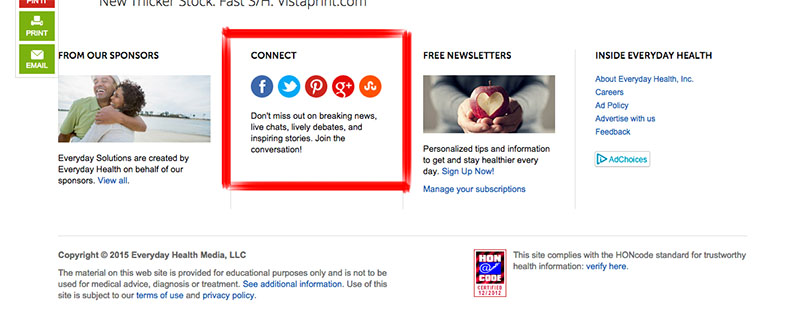
The only consistent email capture form appears buried in the footer:
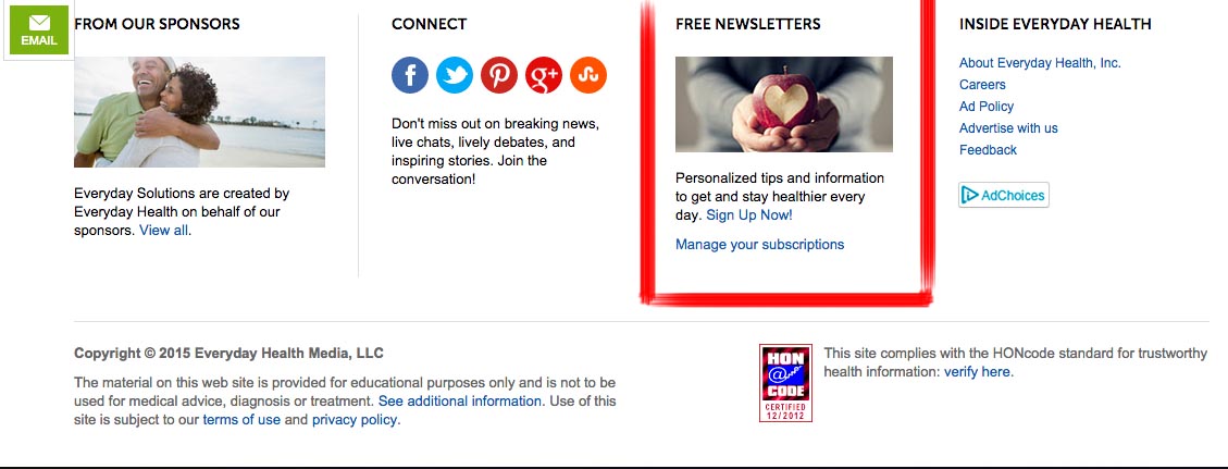 Besides improving its placement, I would recommend giving an immediate free resource for signing up such as a downloadable ebook or email course on a popular topic. A more concrete, specific, and immediate value should convert better than a general newsletter.
Social Follow/Share
On pretty much every content type there is a fixed position social sharing panel that follows visitors as they scroll down the page.
 Two things to note about this particular implementation.
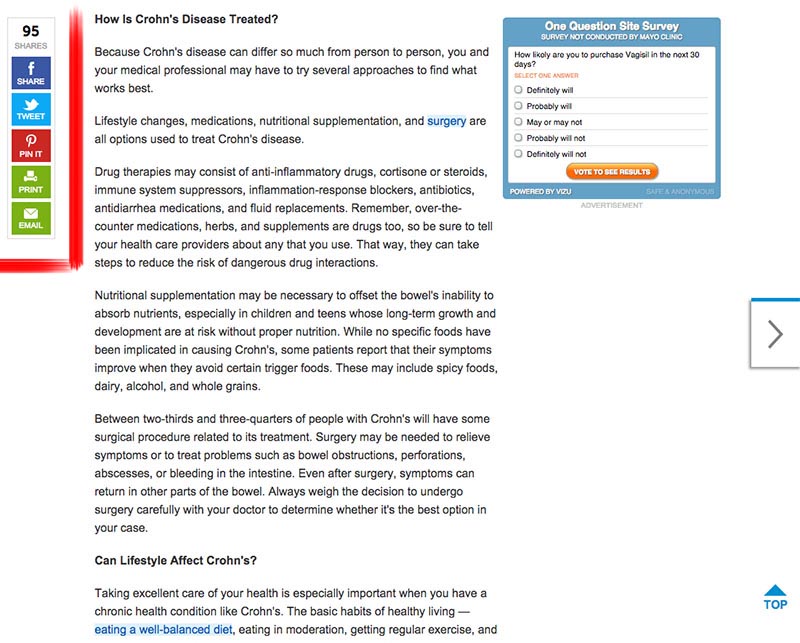
First, only 5 options are present, email, print, Pinterest, Facebook, and Twitter. Instead of bombarding the visitor with tons of options, Everyday Health has pared down the choices to essentially the most popular sharing options for their audience.
Second, the total number of shares is displayed at the top. This works for Everyday Health because almost every single piece of content they’ve published has a healthy number of shares so the high number works as social proof that the content is valuable and share worthy.
If you have low or no sharing on a piece of content, displaying the total number of shares can have the opposite effect and make your website look like a ghost town.
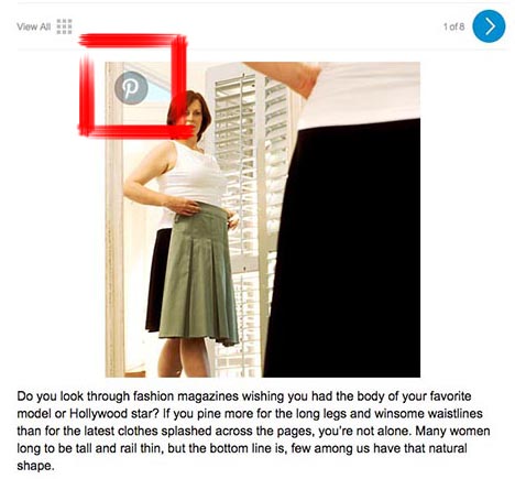
Another social sharing strategy I like is Everyday Health’s use of the Pinterest P icon overlaid on all of their slideshow images. I’ve found that Pinterest works great for slideshow sharing and promotion.
 As for getting social follows, the only call to action is buried in the footer.
 Putting something inline in the content will almost always have a higher engagement rate. One media company that is getting great social engagement on their content is Upworthy and it’s easy to see why.
This appears after the first paragraph of most of their content:
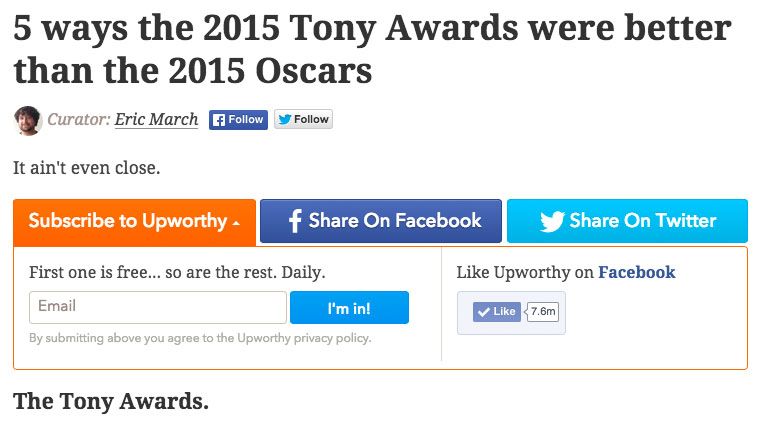 Upworthy’s implementation might be a little bit over the top for your aesthetic but you get the idea. A subtler version might slide nicely into your content templates and drastically increase your social following and sharing.
Conclusion
Despite being one of the most popular websites in a huge niche, Everyday Health still has lots of exciting opportunities to maximize their pages per visit and repeat visitor funnels.
That being said, media site funnels are complicated and small changes in one area can have big unexpected impacts on other parts of the website. It’s crucial to do controlled testing, one improvement at a time, and to watch all the key metrics around the site to see the total impact of the change.
That makes prioritizing tests an important part of the plan. To prioritize I would examine the financials of each funnel and see what achievable improvements would mean to the overall ad revenue. I’d also weigh the cost of technical implementation for each change.
From this criteria, a prioritized testing plan should become clear.
That’s it for Web Funnel Teardown number two. I hope you enjoyed it. If you’d like to get next week’s free in your inbox, signup here.
Want to know how well your web funnel is doing?
Enter your email address and website url and I’ll send you a free user friction report card that grades each step in your signup flow.