«9 Google Analytics Gotchas
Well over half of the top 1 million websites use Google Analytics. The free version delivers incredible value so GA's popularity is unsurprising.
Despite its widespread adoption, Google Analytics is not the easiest tool to understand. The user interfaces can be confusing and many of the data labels can lead to false conclusions unless you understand exactly what they mean.
Over the many years I’ve used GA to help businesses get more paying customers, I’ve come across a number of common pitfalls that I’d like to share in order to help companies stop making faulty conclusions from their data.
Average Session Duration AKA “Time On Site”
Average session duration seems like such a simple and innocent statistic. What could be easier to understand? How long does a visitor spend on your website before leaving. The only problem is, that’s not quite what GA’s “average session duration” means.
What it actually means is:
“How long a visitor spends on your website excluding the time spent viewing the last page they visit.”
For example, if a visitor views 3 pages on your website and spends the following time on each page:
-
Page 1: 10 seconds
-
Page 2: 20 seconds
-
Page 3: 2 minutes
The time on site will be recorded as 15 seconds, or the average of page 1 and page 2. Page 3 is excluded.
If a visitor only views a single page, their time on site will be recorded as 00:00.
The reason for the confusion is that GA doesn’t automatically track when a visitor “exits” your website. It knows they didn’t view another page but it doesn’t know exactly what time they left that final page because there is no automatic “exit event.” It only knows the time of the final engagement on your website which is usually landing on rather than exiting a page.
That’s why a visitor who arrives and then bounces, even after viewing a page for 10 minutes, has a session duration of zero.
Referral Spam
 A common problem for smaller websites is “referral spam,” the black hat marketing technique where fake traffic is sent to your website from the spammer’s website. These “visits” appears in the referral traffic bucket and can skew your actual numbers making it seem like you have more traffic than you actually do.
Referral traffic is really exciting to get, especially for a young website. The unsuspecting webmaster will visit the referring website to eagerly search for the mention of their own site only to be disappointed when there is nothing there but spam.
Why GA hasn’t figured out a way to prevent this yet is disappointing but here is a technique you can use to prevent this fake traffic from polluting your numbers.
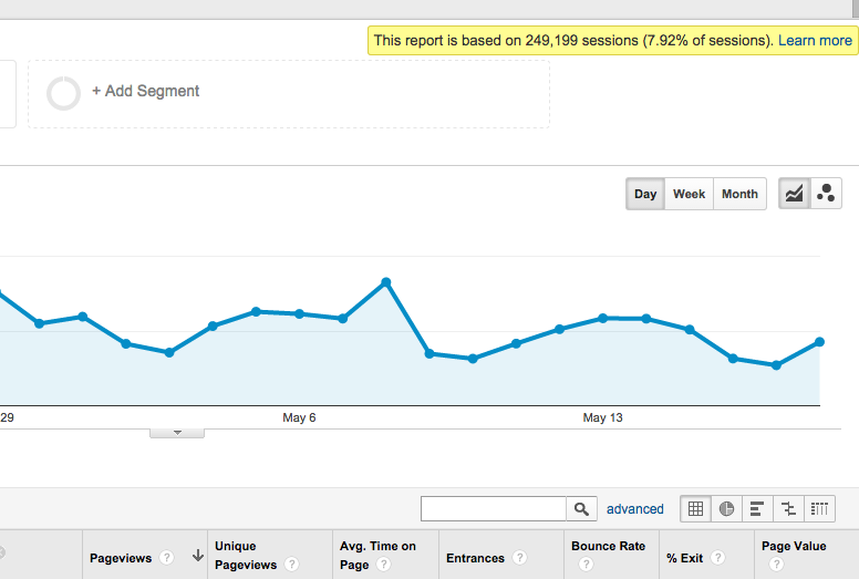
Sneaky Date Ranges
![]() Being aware of what date range you’re viewing is crucial to understanding the numbers that you’re looking at. That may seem obvious, but what isn’t obvious is the way GA’s date range will change unpredictably as you navigate through its various interfaces and dashboards.
Being aware of what date range you’re viewing is crucial to understanding the numbers that you’re looking at. That may seem obvious, but what isn’t obvious is the way GA’s date range will change unpredictably as you navigate through its various interfaces and dashboards.
You’ll set a custom date range, start clicking around, and at some point you might notice that GA has reverted to the default date range of the last 30 days. Even after some research I’ve been unable to figure out what triggers GA to revert to the default. Just make sure you’re always keeping an eye on your date range when drawing date sensitive conclusions from your data.
Not Filtering Out Internal and Test Date
Your most loyal and frequent visitors are likely to be your internal team. Their behavior will usually be different than your other visitors and having the two sets of data mixed can cause you to draw skewed conclusions about your regular visitors.
This is especially worrisome if you have a QA team frequently testing your most important goal conversions. Make sure to filter out your team’s IP addresses and use different GA accounts for your staging and test development environments in order to keep your data clean.
Next Page Path
GA has a really useful dimension known as “Previous Page Path” which tells you what page a user came from before landing on a particular page. This can help you trace the way visitors move through your website.
So it would follow that “Next Page Path” would be the page a visitor went to after the listed page. However that’s not the case. “Next Page Path” actually refers to the page after the “Previous Page Path” or in simpler terms, the “current page.”
That’s why you’ll see something like page: “/” and next page path: “/”. The user didn’t just hit refresh. It’s just the way GA works.
I’ve yet to figure out a use for GA’s “next page path” but just make sure you don’t think it’s telling you where your user went next after visiting a certain page.
Sampling
Google analytics does an amazing job allowing you to navigate through massive amounts of data at surprisingly rapid speeds. This is because it does a lot of data pre-processing to have reports ready for you ahead of time.
Some reports are not pre-processed however. In order to keep the unprocessed reports speedy, GA uses something called “sampling” on larger data sets. Sampling attempts to extrapolate the full data set based on a smaller percentage of the data. While speedier, sampled data isn’t 100% accurate.
For large data sets that don’t need to be completely accurate (such as millions of pageviews), sampled data is fine. The difference between 1.23 million pageviews and 1.21 million is rarely important.
However, if you’re running a test on a smaller sample of goal conversions, sampling can cause some problems. In an A/B test, the difference between 100 conversion, and 80 conversion can be very significant.
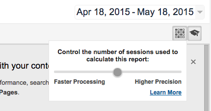
It’s important to be aware of when sampling is in effect so look for this yellow notification:
 The percentage of sessions you see is how much of your total traffic GA used to extrapolate the numbers listed in this report. You can increase the size of the sample to some degree in order to get slightly more accurate results. This is done by clicking the X button and dragging the slider to the right towards "Higher Precision.”
Bounce Rate vs. Exit Rate
A page’s exit rate is the percentage of time that page was the last page a visitor viewed before leaving your site.
A page’s bounce rate is the percentage of time it was the only page a visitor viewed.
This is a subtle but important distinction that is often misinterpreted.
Direct Traffic
The GA traffic acquisition report is one of the most frequently viewed and useful dashboards. It is usually broken up into Social, Organic Search, Referral, Email, and Direct.
Simple right?
For the most part it is, except for “direct.” Direct would seemingly mean that a user entered your website into their URL bar and hit enter. Actually, direct is GA’s catch all bucket for traffic it doesn’t know what to do with because it doesn’t fit into the other buckets.
If you’re skeptical that so many people are typing your url into their browser bar, you’re probably right.
Users Flow Report
 Website owners are frequently curious about the ways users move through their site. There is a lot that can be learned from that data and GA has a report called “Users Flow” that can be accessed at the bottom of the “Audience” menu.
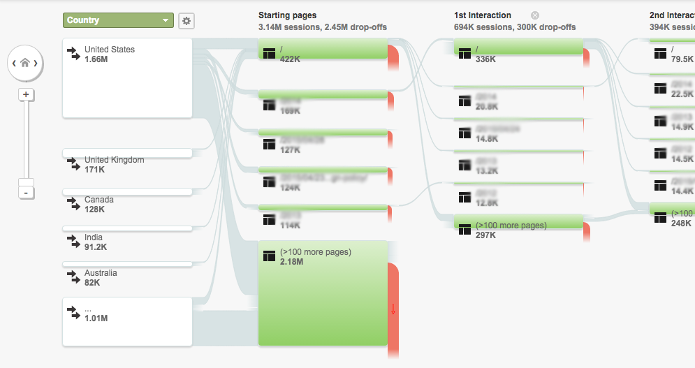
Visualizing complicated user flows is no easy task, but GA’s version is fairly confusing. When you pull up the report you’ll see your most popular starting pages listed out.
However, all is not what it may appear. In order to show you as much data as possible, GA has made some guesses about how to group your content together. It’s likely that what looks like a single page is in fact many, sometimes hundreds of pages grouped into one.
To find out, click on a “page” and then select “group details.” Here GA will show you the top 15 pages in the group but if there are more than 15, you’re out of luck to even know what pages are included.
This problem alone can make the default user flow report useless for many sites.
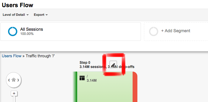
However, wouldn’t it be nice if we see the user flow for one particular page or a group of pages we define? That actually is possible, although it's difficult to find the functionality to do it within GA.
First, click again on any one of the “starting pages” and select “explore traffic through here.” On the next screen you’ll see a small “pencil” button towards the top of the “Step 0” graph. It’ll probably be smushed up against the text and difficult to see.
 If you click that button you’ll be shown a menu where you can define a page group. If you’re good with regular expressions you can do a lot with this. Even if you’re not, just enter in the URL of the page you want to explore in the expression field and you’ll see what you’re looking for.
Use the left and right arrows to explore the user flow chart and utilize the “+step” links at the far left and right to see further into the future or past.
Conclusion
Those are the nine most common and painful Google Analytics problems I’ve seen in my years helping businesses with their analytics. If you have any GA or general web analytics questions for me, please leave them in the comments and I’ll be happy to answer them.
Want to know how well your web funnel is doing?
Enter your email address and website url and I’ll send you a free user friction report card that grades each step in your signup flow.